I was approached by HealthWiz to help design and develop their web product. This was my first time skipping design tools altogether and designing entirely in code, using flexbox, css transitions and animations.
HealthWiz is a tool to go from understanding symptoms to booking a doctor in just a few minutes. It marries data and functionality from many disparate sources into one cohesive experience.
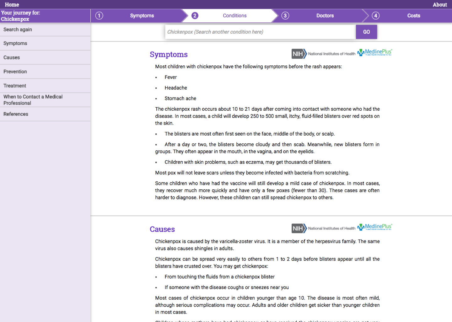
Before I started, the HealthWiz team already created an MVP of their product. Below is a screenshot.

The product followed a strict flow:
- Type in symptoms to try to identify a condition the user may have
- Read about conditions in detail
- Find a doctor to treat the condition
- Estimate costs of treatment and medicine
UX Design
I helped the HealthWiz team pinpoint the problem we want to solve, the assumptions we are making and the hypotheses we want to test. We then translated that into design to quickly validate our assumptions and continue iterating. At the same time, we wanted to solve some pure design issues like readability, coherent navigation, etc.
After doing a UX audit and collecting feedback and interviews from early users. We started restructuring the product. We found that the rigid structure of the original product didn't serve many of the other use cases like simply finding a doctor or understanding a condition. So, we split these different parts up and removed the rigid flow.
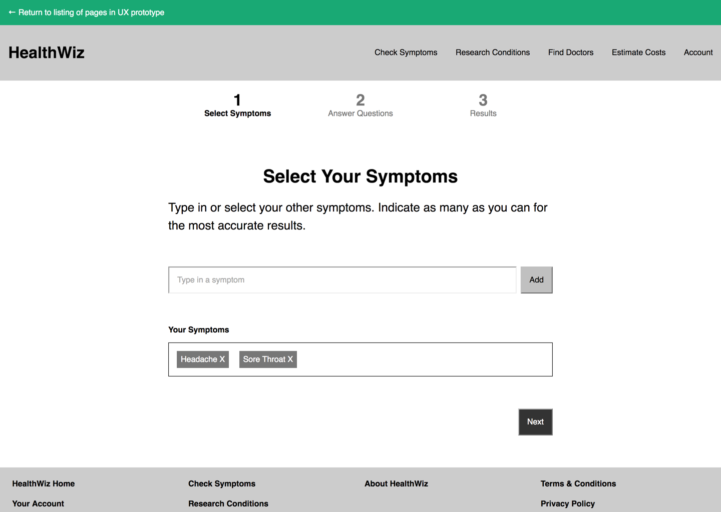
I then started developing a UX prototype using a static site generator and HTML/CSS/JS. Using this, we were able to quickly sanity test the product before continuing on to visual design. Below is an example of a UX prototype screen.

Visual Design
At this point, we were already working with a brand designer on a logo and brand colors, so I was able to jump right into to visual design and polish. Since we were already using a static site generator, it was very easy to deliver a set of composable UI components.
One of the many details we worked on is a sticky header that makes navigation of some of the longer pages much easier. You can see it in the video below.
One of the other key screens is the doctor search screen. We found that the goals of this feature are very similar to the search feature in Airbnb. So, we decided to replicate that view. Making it responsively adapt to different screensizes purely in CSS was a challenge, but with flexbox, I was able to find a way. You can see it below
Conclusion
Designing in code drastically decreased the amount of time spent translating the designing into a working product. I didn't have to spend a lot of time writing up specs to describe the different changes between mobile and desktop because all that knowledge was included in the code.