Mushi Labs, an SEO agency in San Francisco, approached me to help them design their first product, Clearscope. It's a tool that allows writers to predict search engine performance of their content before they publish.
The goal of this design excercise was to take the barebones proof of concept they had already developed and create a product that could be marketed and sold to larger companies. Since the product was in its early stages, we prioritized creating a design system that would easily allow UX and UI changes in the future as we recieve user feedback.
The first step was to develop a brand for Clearscope. Since I originally used Gotham Rounded for the Mushi Labs logo, I used it again for Clearscope's logo. This allowed us to make a new brand while maintaining a connection with Mushi Labs' identity.

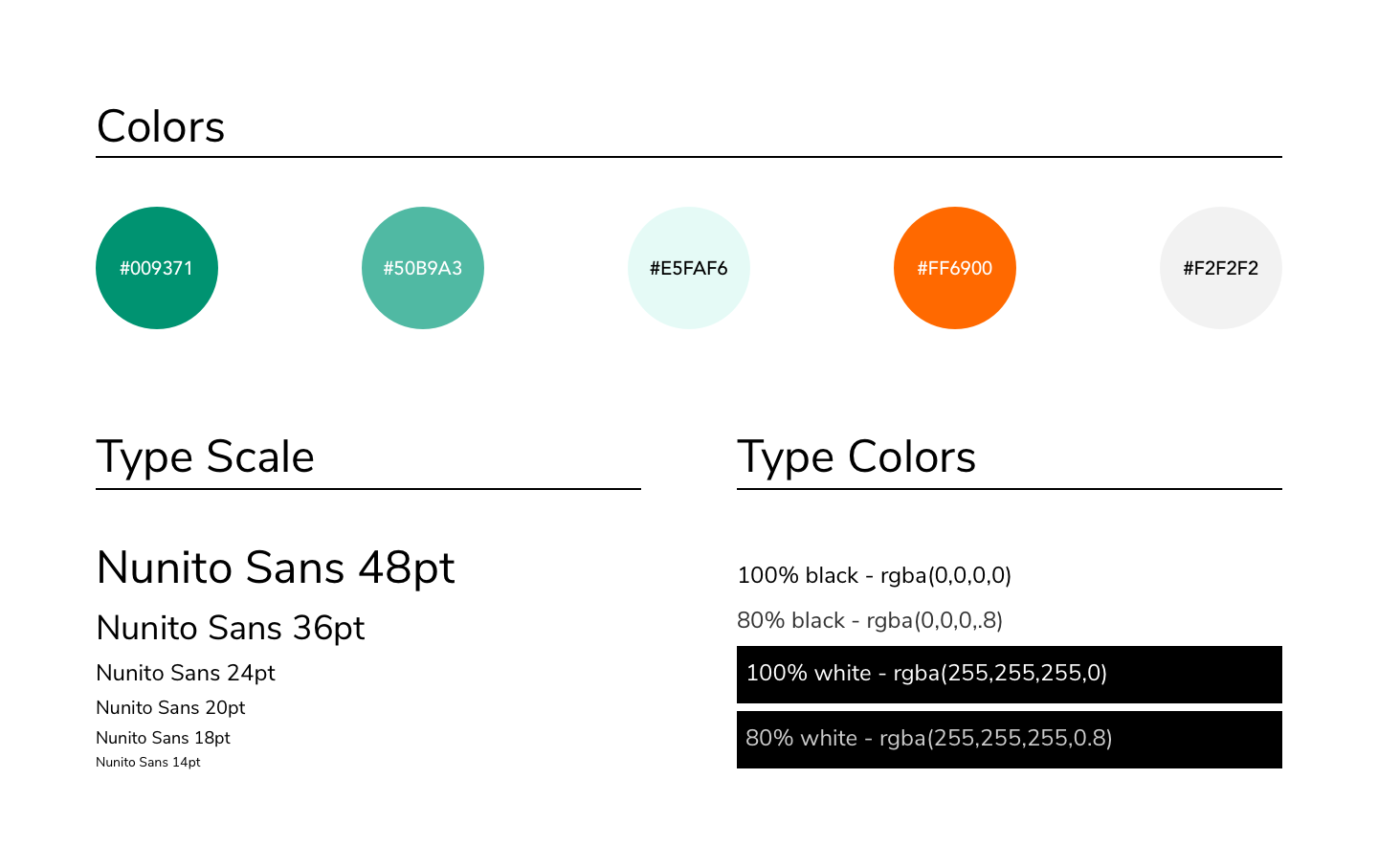
Next, I created a color palette that would stand out from competitors while still feeling modern and being color blind friendly. I then chose a Nunito as the typeface for the product. It has similar letterforms to Gotham Rounded, but isn't costly to license like our first choice, Avenir.

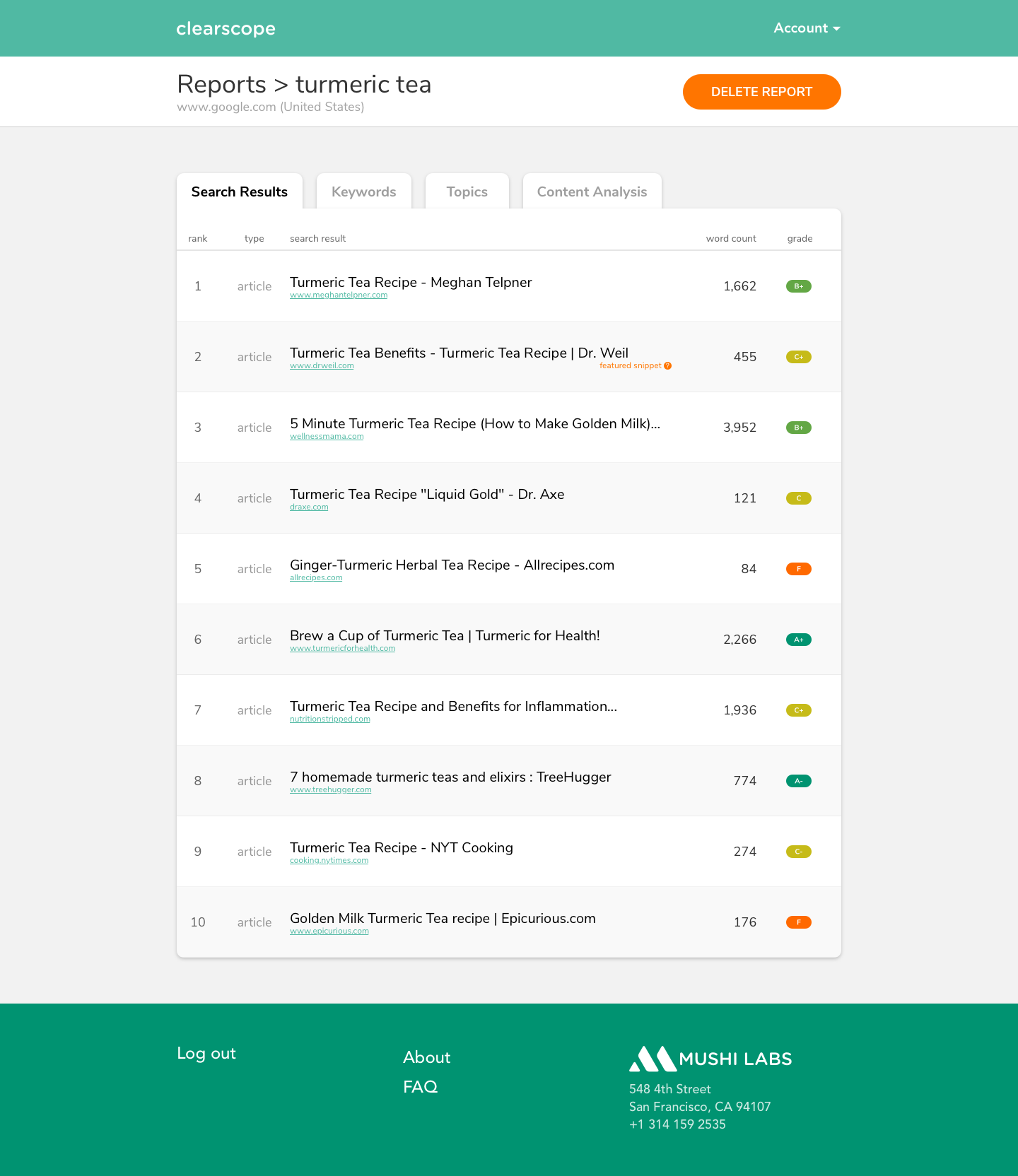
Below is one of the many screens that I designed using a system of components. We can clearly see the secondary navigation which includes breadcrumbs to allow future expansion of the product. There is also a prominent action button that changes depending on the context and the current view.
You can also see some subtle visual touches like the grade bubbles that follow a color gradient and light gray alternating stripes that increase readability in the table.

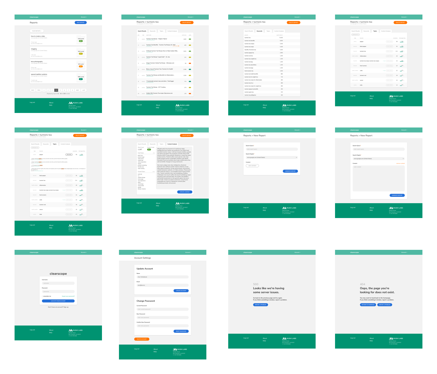
Below is a selection of the screens I designed using the aformentioned system of components.
